Do’s and Don’ts for getting the best commercial interior design
Comfortable space is needed even though you are living in a city apartment or a farm cottage. Achieving this comfort and warmth in a commercial space becomes undisputedly more significant due to the amount of crowd commercial faces experience.
Effortless interior design is a great way to ensure maximum professionalism with the elegance of a welcoming environment.
While working with a team of professional interior designers, you can mark out every detail critically. However, there is no guarantee that things cannot slip out of your mind, and therefore, we have a list of some do’s and don’ts to help you stay on top and get the best out of your commercial interior designs.
1. Do integrate a theme
The themed restaurants and dine-ins tend to be preferable for suitable occasions. We are not discussing the themes tagged as cheesy but a generalized concept that creates a suitable atmosphere for your target audience. Choosing a theme that passes the test of time is a wise option.
A simple example is if your establishment is situated near a beach, then the most suitable theme you can add is coastal. Without making it cliche, be creative and integrate different colors in designs to make your establishment stand out among others.
2. Don’t forget about the lighting
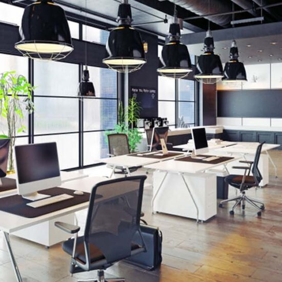
The Centre of design lighting plays a fundamental role in fitting the interior. Apart from the technical utility of lighting, psychological studies provide evidence that lighting can affect consumers’ emotional responses, and their four can be used as a manipulative tactic by businesses.
Bright lighting is the best fit to make the interiors look energetic, whereas high-contrast lighting with low brightness gives a calming ambiance.
3. Do add an open floor plan
Communal spaces such as restaurants and cafes play a big role in people’s lives. The connection between your restaurant with the people must be authentic to allow them to feel more comfortable and consider their choices. This small step can be taken by adding open floor plans to your fit-out. Such plans work best for traditional restaurants such as Sushi bars and Italian pizzerias.
You can incorporate an open kitchen for your guests and diners to see the food preparation, ultimately expanding your brand identity and mission. Moreover, adding a glass wall between the indoor and outdoor dining areas creates a sense of inclusivity that people enjoy.
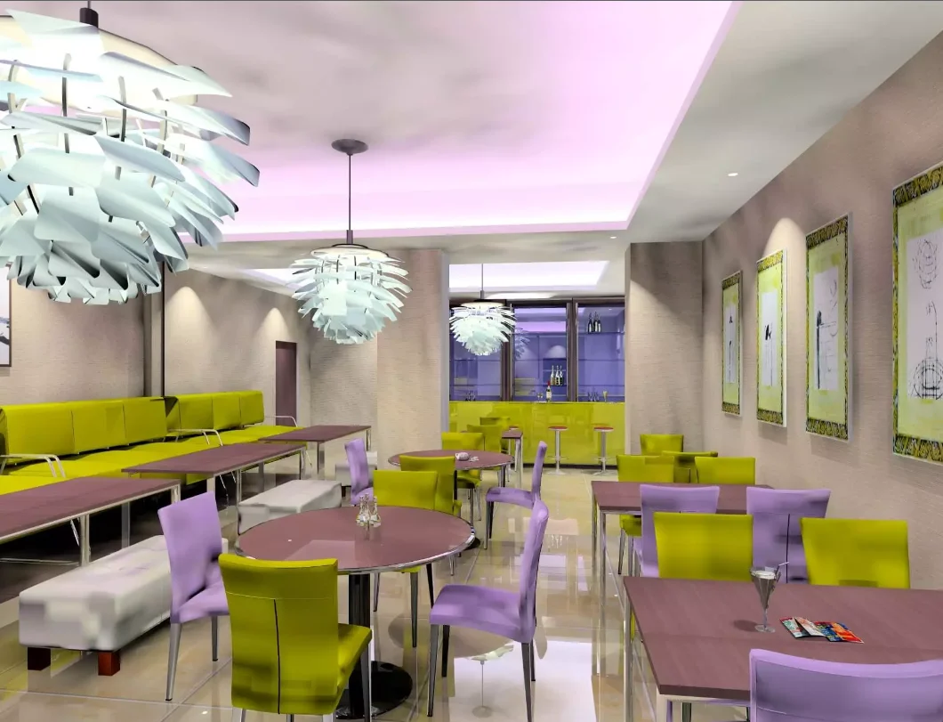
4. Remember the color psychology
Have you ever wondered why most fast-food brands and restaurants use red in their interior designs and logos? This is because the red color induces a greater appetite. Human behaviors are very influential and can be influenced by every minor detail that we may not consciously consider important.
Colors psychology is one such thing that unconsciously influences energy levels, productivity, motivation, interest, and self-esteem. As a business owner, you can utilize this factor and customize your fit-out interior designs. Go with the bright and warm palette to create a youthful atmosphere, whereas if you expect a relaxing ambiance, then blue and coastal colors are the Vibes for you.
5. Do add organic elements
The best way to bring life to your space is by adding natural elements that elevate that design and bring you closer to nature. The best examples are hanging plant baskets, floral arrangements, table decorations, and exotic flour boxes.
You can choose from different sizes, dimensions, and types and add them as a statement piece.
In conclusion, planning and executing such a vast project alone can be overwhelming, and achieving the professional results you may expect is hard. Hiring a professional interior designer can be helpful to sort things out more easily and take guidance over every detail with guaranteed results benefiting you in the long run.


No Comments
Sorry, the comment form is closed at this time.